Trinity Sweets already had what matters most: desserts that photograph well and make sense for hospitality. What they did not have was a place to send a hotel, restaurant, café, or catering manager after the first conversation. There was no single page for the range, no clear partner story, and no simple path from interest to inquiry.
That made the business look smaller than it was. A potential partner could see a photo on Instagram, but not the full offer, the delivery angle, the product categories, or why Trinity Sweets is built for professional kitchens and service teams.
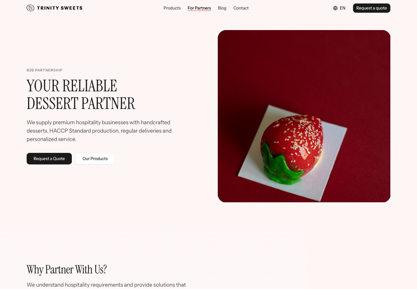
Built for partners first
The key decision was to treat the site as a B2B sales tool, not as a standard bakery website. Private events still matter, but the main job was different: show a buyer that Trinity Sweets can supply a hospitality operation with reliable desserts, clear product information, and a fast way to start a conversation.
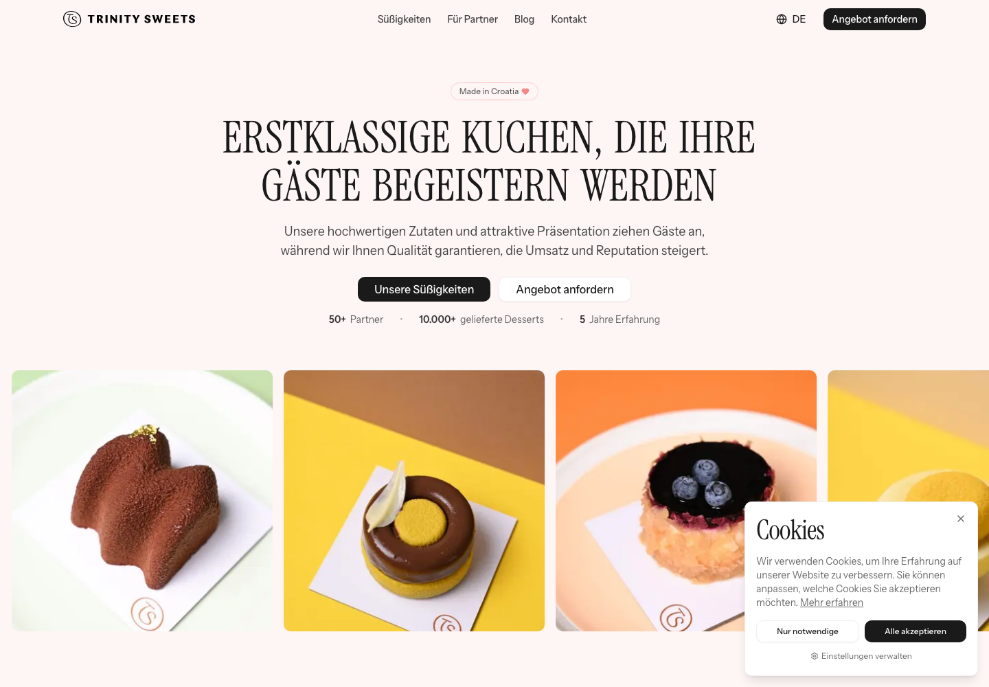
The homepage leads with premium desserts for hospitality, then keeps pointing toward the same action: browse the range or request a quote. The copy had to be plain enough for quick scanning and specific enough for the people who actually make buying decisions.
A product range people can judge quickly
The client already had strong product photography, so the design gives the desserts room to do the selling. The catalog separates cakes and individual portions, shows ingredients and allergens, and keeps the product cards readable instead of turning the page into a mood board.
For a restaurant or hotel, the important detail is not only how a dessert looks. It is whether it fits the menu, the service format, the guest expectation, and the ordering process. That is why the product pages carry practical details, not just names and photos.
One site for more than one market
Trinity Sweets sells from Croatia, but the audience is wider than Croatia. The site was written and built in Croatian, English, and German, with localized metadata and language routes so the same offer can be sent to partners in different markets without rewriting the pitch every time.
The German version was especially important because the site speaks to buyers in Munich, Bavaria, and the wider Central European hospitality market. The language switcher is not decoration. It supports the actual sales conversation.
A clearer way to start the partnership
The partner page explains who Trinity Sweets serves, what kind of collaboration they offer, and what the next steps look like. The contact flow collects the context that matters: business type, interest, country, and message, so an inquiry starts with useful information instead of a vague email.
The result is a professional place Trinity Sweets can send to potential partners. Instead of explaining the whole offer from scratch, they can point to a site that shows the desserts, the market, the process, and the way to begin.
There was no place for clients to browse our desserts. Now everything is in one spot: easy, clear, and a form that leads to an inquiry in seconds.
Ivan Ešegović, Trinity Sweets